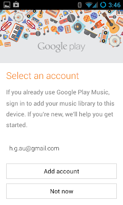
Seems straightforward enough; but have a look at the screen - what you would press?

Looks like there's a choice of two commands, either Add account or Not now. But there's another command there ... the email address is a clickable hyperlink, but there's no indication that it is - no underline or radically different font. The Add account button actually prompts you to type in a new email address, i.e. not the one listed. One of the most confusing UI designs I've seen lately.
As discussed in this StackExchange.UX post, there's no strict rule about it, but buttons usually perform a command and hyperlinks usually take you somewhere new.
To improve it, maybe there should be a "Use" button to the right of each email address.
Follow @dodgy_coder
Subscribe to posts via RSS
how do i creat a hyper link using android??
ReplyDeleteNot totally sure, but I think its just a standard text/label control with an event handler attached that does something when you touch it. I don't think there's a specific 'hyperlink' control per se.
DeleteI agree it would have been nicer if they had just used buttons or or a dropdown menu for the email addresses.
ReplyDelete
ReplyDeleteHello Mr Dodgy,
Nice blog! I would like to discuss a partnership opportunity between
our sites. Is there an email address I can contact you in private?
Thanks,
Eleftheria Kiourtzoglou
Head of Editorial Team
Java Code Geeks
email: [dot][at]javacodegeeks[dot]com